The QCheckBox widget provides a checkbox with a text label. 更多...
继承 QAbstractButton .
The QCheckBox widget provides a checkbox with a text label.
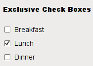
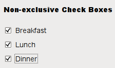
A QCheckBox is an option button that can be switched on (checked) or off (unchecked). Checkboxes are typically used to represent features in an application that can be enabled or disabled without affecting others, but different types of behavior can be implemented. For example, a QButtonGroup can be used to group check buttons logically, allowing exclusive checkboxes. However, QButtonGroup does not provide any visual representation.
The image below further illustrates the differences between exclusive and non-exclusive checkboxes.
|
|
Whenever a checkbox is checked or cleared it emits the signal stateChanged (). Connect to this signal if you want to trigger an action each time the checkbox changes state. You can use isChecked () to query whether or not a checkbox is checked.
In addition to the usual checked and unchecked states, QCheckBox optionally provides a third state to indicate "no change". This is useful whenever you need to give the user the option of neither checking nor unchecking a checkbox. If you need this third state, enable it with setTristate (), and use checkState () to query the current toggle state.
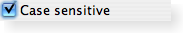
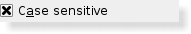
就像 QPushButton , a checkbox displays text, and optionally a small icon. The icon is set with setIcon (). The text can be set in the constructor or with setText (). A shortcut key can be specified by preceding the preferred character with an ampersand. For example:
QCheckBox *checkbox = new QCheckBox("C&ase sensitive", this);
在此范例中快捷方式是 Alt+A 。见 QShortcut documentation for details (to display an actual ampersand, use '&&').
重要继承函数: text (), setText (), text (), pixmap (), setPixmap (), accel (), setAccel (), isToggleButton (), setDown (), isDown (), isOn (), checkState (), autoRepeat (), isExclusiveToggle(), group (), setAutoRepeat (), toggle (), pressed (), released (), clicked (), toggled (), checkState (),和 stateChanged ().
|
A checkbox shown in the Macintosh widget style . |
|
A checkbox shown in the Windows XP widget style . |
|
A checkbox shown in the Plastique widget style . |
parent argument, if not None, causes self to be owned by Qt instead of PyQt.
Constructs a checkbox with the given parent , but with no text.
parent 被传递给 QAbstractButton 构造函数。
parent argument, if not None, causes self to be owned by Qt instead of PyQt.
Constructs a checkbox with the given parent and text .
parent 被传递给 QAbstractButton 构造函数。
Returns the check box's check state. If you do not need tristate support, you can also use QAbstractButton.isChecked () which returns a boolean.
另请参阅 setCheckState () 和 Qt.CheckState .
重实现自 QAbstractButton.checkStateSet ().
重实现自 QObject.event ().
重实现自 QAbstractButton.hitButton ().
初始化 option 采用值来自此 QCheckBox . This method is useful for subclasses that require a QStyleOptionButton , but do not want to fill in all the information themselves.
另请参阅 QStyleOption.initFrom ().
重实现自 QWidget.minimumSizeHint ().
该函数在 Qt 4.8 引入。
重实现自 QWidget.mouseMoveEvent ().
重实现自 QAbstractButton.nextCheckState ().
重实现自 QWidget.paintEvent ().
Sets the check box's check state to state . If you do not need tristate support, you can also use QAbstractButton.setChecked () which takes a boolean.
另请参阅 checkState () 和 Qt.CheckState .
重实现自 QWidget.sizeHint ().
This is the default overload of this signal.
This signal is emitted whenever the check box's state changes, i.e. whenever the user checks or unchecks it.
state contains the check box's new Qt.CheckState .