The QTabBar class provides a tab bar, e.g. for use in tabbed dialogs. 更多...
继承 QWidget .
The QTabBar class provides a tab bar, e.g. for use in tabbed dialogs.
QTabBar is straightforward to use; it draws the tabs using one of the predefined shapes ,和 emits a signal when a tab is selected. It can be subclassed to tailor the look and feel. Qt also provides a ready-made QTabWidget .
每个选项卡有 tabText (), an optional tabIcon (),可选 tabToolTip (),可选 tabWhatsThis () 和可选 tabData (). The tabs's attributes can be changed with setTabText (), setTabIcon (), setTabToolTip (), setTabWhatsThis and setTabData (). Each tabs can be enabled or disabled individually with setTabEnabled ().
Each tab can display text in a distinct color. The current text color for a tab can be found with the tabTextColor () function. Set the text color for a particular tab with setTabTextColor ().
添加选项卡使用 addTab (), or inserted at particular positions using insertTab (). The total number of tabs is given by count (). Tabs can be removed from the tab bar with removeTab (). Combining removeTab () 和 insertTab () allows you to move tabs to different positions.
shape property defines the tabs' appearance. The choice of shape is a matter of taste, although tab dialogs (for preferences and similar) invariably use RoundedNorth . Tab controls in windows other than dialogs almost always use either RoundedSouth or TriangularSouth . Many spreadsheets and other tab controls in which all the pages are essentially similar use TriangularSouth , whereas RoundedSouth is used mostly when the pages are different (e.g. a multi-page tool palette). The default in QTabBar is RoundedNorth .
The most important part of QTabBar's API is the currentChanged () signal. This is emitted whenever the current tab changes (even at startup, when the current tab changes from 'none'). There is also a slot, setCurrentIndex (), which can be used to select a tab programmatically. The function currentIndex () returns the index of the current tab, count holds the number of tabs.
QTabBar creates automatic mnemonic keys in the manner of QAbstractButton ; e.g. if a tab's label is "&Graphics", Alt+G becomes a shortcut key for switching to that tab.
The following virtual functions may need to be reimplemented in order to tailor the look and feel or store extra data with each tab:
对于子类,可能还需要 tabRect () functions which returns the visual geometry of a single tab.
|
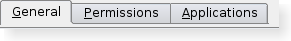
A tab bar shown in the Plastique widget style. |
|
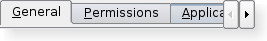
A truncated tab bar shown in the Plastique widget style. |
此枚举类型列表 Widget 在选项卡上的位置。
| 常量 | 值 | 描述 |
|---|---|---|
| QTabBar.LeftSide | 0 | 选项卡的左侧。 |
| QTabBar.RightSide | 1 | 选项卡的右侧。 |
该枚举在 Qt 4.5 引入或被修改。
此枚举类型列出了行为,为 QTabBar when a tab is removed and the tab being removed is also the current tab.
| 常量 | 值 | 描述 |
|---|---|---|
| QTabBar.SelectLeftTab | 0 | Select the tab to the left of the one being removed. |
| QTabBar.SelectRightTab | 1 | Select the tab to the right of the one being removed. |
| QTabBar.SelectPreviousTab | 2 | 选择先前选中的选项卡。 |
该枚举在 Qt 4.5 引入或被修改。
此枚举类型列出了受支持的内置形状,由 QTabBar . Treat these as hints as some styles may not render some of the shapes. However, position should be honored.
| 常量 | 值 | 描述 |
|---|---|---|
| QTabBar.RoundedNorth | 0 | The normal rounded look above the pages |
| QTabBar.RoundedSouth | 1 | The normal rounded look below the pages |
| QTabBar.RoundedWest | 2 | The normal rounded look on the left side of the pages |
| QTabBar.RoundedEast | 3 | The normal rounded look on the right side the pages |
| QTabBar.TriangularNorth | 4 | 在页面上方的三角形选项卡。 |
| QTabBar.TriangularSouth | 5 | Triangular tabs similar to those used in the Excel spreadsheet, for example |
| QTabBar.TriangularWest | 6 | Triangular tabs on the left of the pages. |
| QTabBar.TriangularEast | 7 | Triangular tabs on the right of the 页面。 |
parent argument, if not None, causes self to be owned by Qt instead of PyQt.
创建新的选项卡栏,采用给定 parent .
添加新选项卡采用文本 text . Returns the new tab's index.
这是重载函数。
添加新选项卡采用图标 icon 和文本 text . Returns the new tab's index.
重实现自 QWidget.changeEvent ().
重实现自 QObject.event ().
重实现自 QWidget.hideEvent ().
初始化 option 采用值从选项卡在 tabIndex . This method is useful for subclasses when they need a QStyleOptionTab , QStyleOptionTabV2 ,或 QStyleOptionTabV3 but don't want to fill in all the information themselves. This function will check the version of the QStyleOptionTab and fill in the additional values for a QStyleOptionTabV2 and QStyleOptionTabV3 .
另请参阅 QStyleOption.initFrom () 和 QTabWidget.initStyleOption ().
插入新选项卡采用文本 text 在位置 index 。若 index is out of range, the new tab is appened. Returns the new tab's index.
这是重载函数。
插入新选项卡采用图标 icon 和文本 text at position index 。若 index is out of range, the new tab is appended. Returns the new tab's index.
若 QTabBar was empty before this function is called, the inserted tab becomes the current tab.
Inserting a new tab at an index less than or equal to the current index will increment the current index, but keep the current tab.
返回 true 若选项卡在位置 index is enabled; otherwise returns false.
重实现自 QWidget.keyPressEvent ().
重实现自 QWidget.minimumSizeHint ().
重实现自 QWidget.mouseMoveEvent ().
重实现自 QWidget.mousePressEvent ().
重实现自 QWidget.mouseReleaseEvent ().
移动索引位置项 from 到索引位置 to .
该函数在 Qt 4.5 引入。
另请参阅 tabMoved () and tabLayoutChange ().
重实现自 QWidget.paintEvent ().
移除选项卡,在位置 index .
另请参阅 SelectionBehavior .
重实现自 QWidget.resizeEvent ().
This method is also a Qt slot with the C++ signature void setCurrentIndex(int) .
widget argument has it's ownership transferred to Qt.
集 widget 在选项卡 index . The widget is placed on the left or right hand side depending upon the position .
任何先前设置 Widget 在 position 被隐藏。
The tab bar will take ownership of the widget and so all widgets set here will be deleted by the tab bar when it is destroyed unless you separately reparent the widget after setting some other widget (or 0).
该函数在 Qt 4.5 引入。
另请参阅 tabButton () and tabsClosable ().
设置选项卡的数据,在位置 index to data .
另请参阅 tabData ().
若 enabled 为 true 则选项卡在位置 index 被启用;否则项在位置 index is disabled.
另请参阅 isTabEnabled ().
设置选项卡的图标,在位置 index to icon .
另请参阅 tabIcon ().
设置选项卡的文本,在位置 index to text .
另请参阅 tabText ().
设置选项卡文本颜色采用给定 index 到指定 color .
如果指定的是无效颜色,选项卡将使用 QTabBar 前景角色代替。
另请参阅 tabTextColor ().
设置选项卡的工具提示,在位置 index to tip .
另请参阅 tabToolTip ().
设置选项卡的 What's This 帮助文本,在位置 index to text .
该函数在 Qt 4.1 引入。
另请参阅 tabWhatsThis ().
重实现自 QWidget.showEvent ().
重实现自 QWidget.sizeHint ().
返回选项卡索引,覆盖 position or -1 if no tab covers position ;
该函数在 Qt 4.3 引入。
返回 Widget 设置选项卡 index and position or 0 if one is not set.
另请参阅 setTabButton ().
返回选项卡的数据,在位置 index ,或 null variant if index 超出范围。
另请参阅 setTabData ().
返回选项卡的图标,在位置 index ,或 null icon if index 超出范围。
另请参阅 setTabIcon ().
This virtual handler is called after a new tab was added or inserted at position index .
另请参阅 tabRemoved ().
This virtual handler is called whenever the tab layout 改变。
另请参阅 tabRect ().
返回选项卡的视觉矩形,在位置 index ,或 null 矩形若 index is out of range.
This virtual handler is called after a tab was removed from position index .
另请参阅 tabInserted ().
返回选项卡大小提示,在位置 index .
返回选项卡的文本,在位置 index ,或 empty string if index 超出范围。
另请参阅 setTabText ().
返回选项卡的文本颜色,采用给定 index , or a invalid color if index 超出范围。
另请参阅 setTabTextColor ().
返回选项卡的工具提示,在位置 index ,或 empty string if index 超出范围。
另请参阅 setTabToolTip ().
返回选项卡的 What's This 帮助文本,在位置 index ,或空字符串若 index is out of range.
该函数在 Qt 4.1 引入。
另请参阅 setTabWhatsThis ().
重实现自 QWidget.wheelEvent ().
This is the default overload of this signal.
This signal is emitted when the tab bar's current tab changes. The new current has the given index , or -1 if there isn't a new one (for example, if there are no tab in the QTabBar )
This is the default overload of this signal.
This signal is emitted when the close button on a tab is clicked. The index 是应被移除的索引。
该函数在 Qt 4.5 引入。
另请参阅 setTabsClosable ().
This is the default overload of this signal.
This signal is emitted when the tab has moved the tab at index position from 到索引位置 to .
注意: QTabWidget will automatically move the page when this signal is emitted from its tab bar.
该函数在 Qt 4.5 引入。
另请参阅 moveTab ().