QComboBox 小部件是组合按钮和弹出列表。 更多...
继承 QWidget .
Inherited by QFontComboBox .
QComboBox 小部件是组合按钮和弹出列表。
A QComboBox provides a means of presenting a list of options to the user in a way that takes up the minimum amount of screen space.
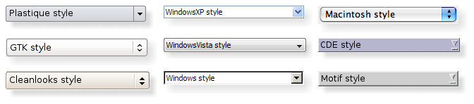
A combobox is a selection widget that displays the current item, and can pop up a list of selectable items. A combobox may be editable, allowing the user to modify each item in the list.
组合框可以包含像素图及字符串; insertItem () 和 setItemText () functions are suitably overloaded. For editable comboboxes, the function clearEditText () is provided, to clear the displayed string without changing the combobox's contents.
There are two signals emitted if the current item of a combobox changes, currentIndexChanged () 和 activated (). currentIndexChanged () 是 always emitted regardless if the change was done programmatically or by user interaction, while activated () is only emitted when the change is caused by user interaction. The highlighted () 信号被发射 when the user highlights an item in the combobox popup list. All three signals exist in two versions, one with a QString 自变量和一个带有 int 自变量。若用户选择或突显像素图,仅 int signals are emitted. Whenever the text of an editable combobox is changed the editTextChanged () signal is emitted.
When the user enters a new string in an editable combobox, the widget may or may not insert it, and it can insert it in several locations. The default policy is is AtBottom but you can change this using setInsertPolicy ().
It is possible to constrain the input to an editable combobox 使用 QValidator ;见 setValidator (). By default, any input is accepted.
可以使用插入函数填充组合框, insertItem () 和 insertItems () for example. Items can be changed with setItemText (). An item can be removed with removeItem () and all items can be removed with clear (). The text of the current item is returned by currentText (), and the text of a numbered item is returned with text (). The current item can be set with setCurrentIndex ()。 number of items in the combobox is returned by count (); the maximum number of items can be set with setMaxCount (). You can allow editing using setEditable (). For editable comboboxes you can set auto-completion using setCompleter () and whether or not the user can add duplicates is set with setDuplicatesEnabled ().
QComboBox 使用 模型/视图框架 for its popup list and to store its items. By default a QStandardItemModel stores the items 和 QListView subclass displays the popuplist. You can access the model and view directly (with model () 和 view ()), but QComboBox also provides functions to set and get item data (e.g., setItemData () 和 itemText ()). You can also set a new model and view (with setModel () 和 setView ()). For the text and icon in the combobox label, the data in the model that has the Qt.DisplayRole and Qt.DecorationRole is used. Note that you cannot alter the SelectionMode of the view (),如通过使用 setSelectionMode() .
此枚举指定什么是 QComboBox should do when a new string is entered by the user.
| 常量 | 值 | 描述 |
|---|---|---|
| QComboBox.NoInsert | 0 | The string will not be inserted into the combobox. |
| QComboBox.InsertAtTop | 1 | The string will be inserted as the first item 在组合框。 |
| QComboBox.InsertAtCurrent | 2 | 当前项将 replaced by the string. |
| QComboBox.InsertAtBottom | 3 | The string will be inserted after the last item in the combobox. |
| QComboBox.InsertAfterCurrent | 4 | The string is inserted after the current item 在组合框。 |
| QComboBox.InsertBeforeCurrent | 5 | The string is inserted before the current item 在组合框。 |
| QComboBox.InsertAlphabetically | 6 | The string is inserted in the alphabetic order 在组合框。 |
This enum specifies how the size hint of the QComboBox should adjust when new content is added or content changes.
| 常量 | 值 | 描述 |
|---|---|---|
| QComboBox.AdjustToContents | 0 | The combobox will always adjust to the contents |
| QComboBox.AdjustToContentsOnFirstShow | 1 | The combobox will adjust to its contents the first time it is shown. |
| QComboBox.AdjustToMinimumContentsLength | 2 | Use AdjustToContents or AdjustToContentsOnFirstShow instead. |
| QComboBox.AdjustToMinimumContentsLengthWithIcon | 3 | The combobox will adjust to minimumContentsLength plus space for an icon. For performance reasons use this policy on large models. |
parent argument, if not None, causes self to be owned by Qt instead of PyQt.
构造组合框采用给定 parent ,使用 default model QStandardItemModel .
把项添加到组合框,采用给定 text ,和 containing the specified userData (存储在 Qt.UserRole ). The item is appended to the list of existing items.
把项添加到组合框,采用给定 icon and text ,和包含指定 userData (stored 在 Qt.UserRole ). The item is appended to the list of existing items.
添加每字符串在给定 texts 到 combobox. Each item is appended to the list of existing items in turn.
重实现自 QWidget.changeEvent ().
This method is also a Qt slot with the C++ signature void clear() .
清零组合框,移除所有项。
Note: If you have set an external model on the combobox this model will still be cleared when calling this function.
This method is also a Qt slot with the C++ signature void clearEditText() .
Clears the contents of the line edit used for editing in the combobox.
Returns the completer that is used to auto complete text input for the combobox.
该函数在 Qt 4.2 引入。
另请参阅 setCompleter () 和 editable .
重实现自 QWidget.contextMenuEvent ().
重实现自 QObject.event ().
返回索引当项包含给定 data 为给定 role ;否则返回 -1。
flags specify how the items in the combobox are searched.
返回索引当项包含给定 text ; otherwise returns -1.
flags specify how the items in the combobox are searched.
重实现自 QWidget.focusInEvent ().
重实现自 QWidget.focusOutEvent ().
重实现自 QWidget.hideEvent ().
Hides the list of items in the combobox if it is currently visible and resets the internal state, so that if the custom pop-up was shown inside the reimplemented showPopup (), then you also need to reimplement the hidePopup() function to hide your custom pop-up and call the base class implementation to reset the internal state whenever your custom pop-up widget is hidden.
另请参阅 showPopup ().
初始化 option 采用值来自此 QComboBox . This method is useful for subclasses when they need a QStyleOptionComboBox , but don't want to fill in all the information themselves.
另请参阅 QStyleOption.initFrom ().
重实现自 QWidget.inputMethodEvent ().
重实现自 QWidget.inputMethodQuery ().
插入 text and userData (存储在 Qt.UserRole ) into the combobox at the given index .
If the index is equal to or higher than the total number of items, the new item is appended to the list of existing items. If the index is zero or negative, the new item is prepended to the list of existing items.
另请参阅 insertItems ().
插入 icon , text and userData (stored 在 Qt.UserRole ) into the combobox at the given index .
If the index is equal to or higher than the total number of items, the new item is appended to the list of existing items. If the index is zero or negative, the new item is prepended to the list of existing items.
另请参阅 insertItems ().
插入字符串从 list into the combobox as separate items, starting at the index 指定。
If the index is equal to or higher than the total number of items, the new items are appended to the list of existing items. If the index is zero or negative, the new items are prepended to the list of existing items.
另请参阅 insertItem ().
将分隔符项插入组合框在给定 index .
If the index is equal to or higher than the total number of items, the new item is appended to the list of existing items. If the index is zero or negative, the new item is prepended to the list of existing items.
该函数在 Qt 4.4 引入。
另请参阅 insertItem ().
返回数据为给定 role 以给定 index in the combobox, or QVariant.Invalid if there is no data for this role.
另请参阅 setItemData ().
返回由弹出列表视图使用的项委托。
另请参阅 setItemDelegate ().
返回图标为给定 index 在组合框。
另请参阅 setItemIcon ().
返回文本为给定 index 在组合框。
另请参阅 setItemText ().
重实现自 QWidget.keyPressEvent ().
重实现自 QWidget.keyReleaseEvent ().
Returns the line edit used to edit items in the combobox, or 0 若没有行编辑。
仅可编辑组合框拥有行编辑。
另请参阅 setLineEdit ().
重实现自 QWidget.minimumSizeHint ().
返回由组合框使用的模型。
另请参阅 setModel ().
重实现自 QWidget.mousePressEvent ().
重实现自 QWidget.mouseReleaseEvent ().
重实现自 QWidget.paintEvent ().
移除项位于给定 index from the combobox. This will update the current index if the index is removed.
此函数什么都不做,若 index 超出范围。
重实现自 QWidget.resizeEvent ().
Returns the root model item index for the items in the combobox.
另请参阅 setRootModelIndex ().
设置 completer to use instead of the current completer. If completer is 0, auto completion is disabled.
默认情况下,对于可编辑组合框, QCompleter that performs case insensitive inline completion is automatically created.
该函数在 Qt 4.2 引入。
另请参阅 completer ().
This method is also a Qt slot with the C++ signature void setEditText(const QString&) .
设置 text 在组合框的文本编辑。
Sets the data role 为项在给定 index in the combobox to the specified value .
另请参阅 itemData ().
Sets the item delegate for the popup list view. The combobox takes ownership of the delegate.
警告: You should not share the same instance of a delegate between comboboxes, widget mappers or views. Doing so can cause incorrect or unintuitive editing behavior since each view connected to a given delegate may receive the closeEditor() signal, and attempt to access, modify or close an editor that has already been closed.
另请参阅 itemDelegate ().
设置 icon 为项在给定 index in the combobox.
另请参阅 itemIcon ().
设置 text 为项在给定 index in the combobox.
另请参阅 itemText ().
edit argument has it's ownership transferred to Qt.
设置行 edit to use instead of the current line edit widget.
组合框拥有行编辑的所有权。
另请参阅 lineEdit ().
把模型设置为 model . model must not be 0. If you want to clear the contents of a model, call clear ().
设置根模型项 index for the items in the combobox.
另请参阅 rootModelIndex ().
设置 validator to use instead of the current validator.
另请参阅 validator ().
itemView argument has it's ownership transferred to Qt.
将组合框弹出所用视图设为给定 itemView 。组合框拥有视图的所有权。
注意:若想要使用方便视图 (像 QListWidget , QTableWidget or QTreeWidget ),确保调用 setModel () on the combobox with the convenience widgets model before calling this function.
另请参阅 view ().
重实现自 QWidget.showEvent ().
Displays the list of items in the combobox. If the list is empty then the no items will be shown.
If you reimplement this function to show a custom pop-up, make sure you call hidePopup () 到 reset the internal state.
另请参阅 hidePopup ().
重实现自 QWidget.sizeHint ().
This implementation caches the size hint to avoid resizing when the contents change dynamically. To invalidate the cached value change the sizeAdjustPolicy .
Returns the validator that is used to constrain text input for the combobox.
另请参阅 setValidator () 和 editable .
返回用于组合框弹出的列表视图。
另请参阅 setView ().
重实现自 QWidget.wheelEvent ().
This is the default overload of this signal.
This signal is sent when the user chooses an item in the combobox. The item's index is passed. Note that this signal is sent even when the choice is not changed. If you need to know when the choice actually changes, use signal currentIndexChanged ().
This signal is sent when the user chooses an item in the combobox. The item's text is passed. Note that this signal is sent even when the choice is not changed. If you need to know when the choice actually changes, use signal currentIndexChanged ().
This is the default overload of this signal.
此信号被发送每当 currentIndex in the combobox changes either through user interaction or programmatically. The item's index is passed or -1 if the combobox becomes empty 或 currentIndex 被重置。
该函数在 Qt 4.1 引入。
此信号被发送每当 currentIndex in the combobox changes either through user interaction or programmatically. The item's text 被传递。
该函数在 Qt 4.1 引入。
This is the default overload of this signal.
This signal is emitted when the text in the combobox's line edit widget is changed. The new text is specified by text .
This is the default overload of this signal.
This signal is sent when an item in the combobox popup list is highlighted by the user. The item's index 被传递。
This signal is sent when an item in the combobox popup list is highlighted by the user. The item's text 被传递。